Airframe
Components
Each card is one component: its Night preview, its group and what the preview shows. Open one for when to use it, do and don't, what you provide and the markup; the gallery renders every preview live in both themes. Each component is a set of af- classes in theme/airframe-components.css, kept in airframe/components/<Name>/ with its README and preview.html.
Foundations
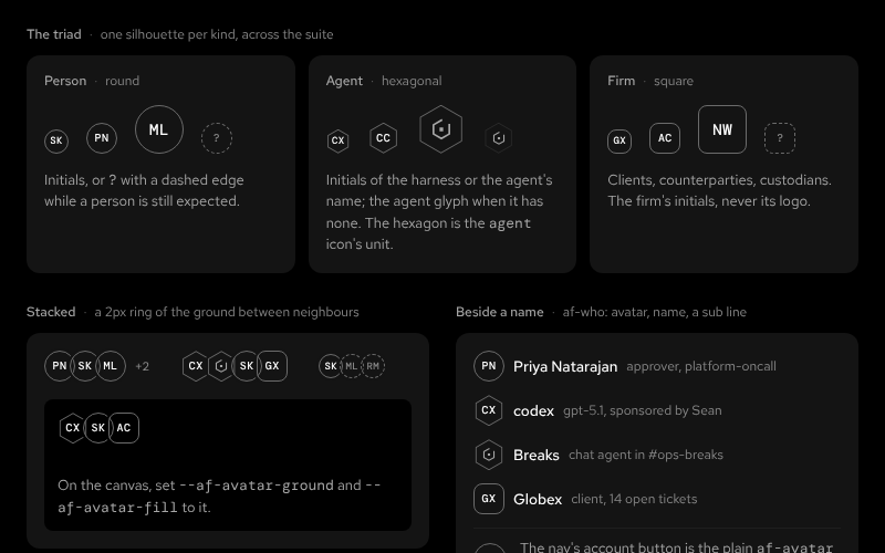 AvatarFoundationsPeople round, agents hexagonal, firms square: initials in mono on a hairline, no fill, no hue; 22, 28 and 44 px; stacked groupsNightDay
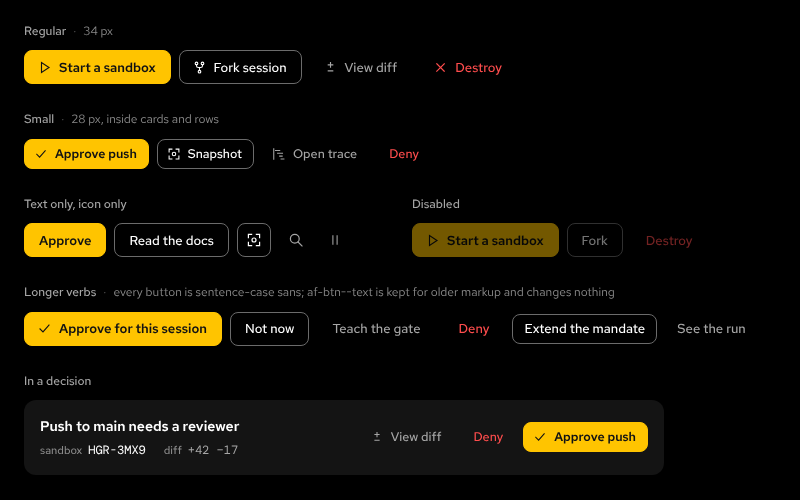 ButtonFoundationsPrimary, secondary, ghost, danger; 34 and 28 px; icons; disabled; the sentence-case text variant for where people readNightDay
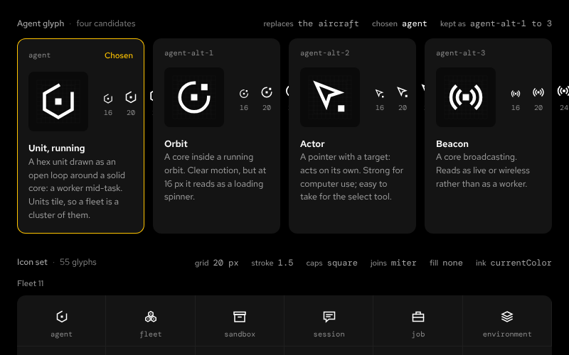 IconsFoundations55 glyphs on a 20 px grid; agent redrawnNightDay
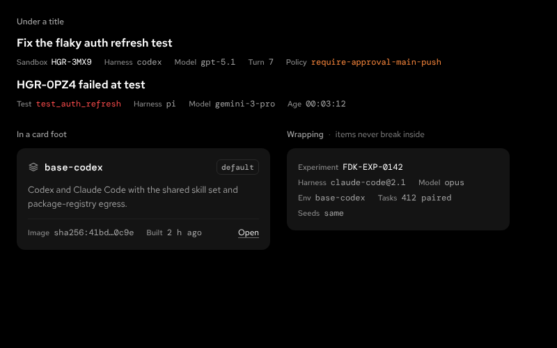 InlineDataFoundationsKeyed metadata: a sentence-case key, then a mono value; never a · b · cNightDay
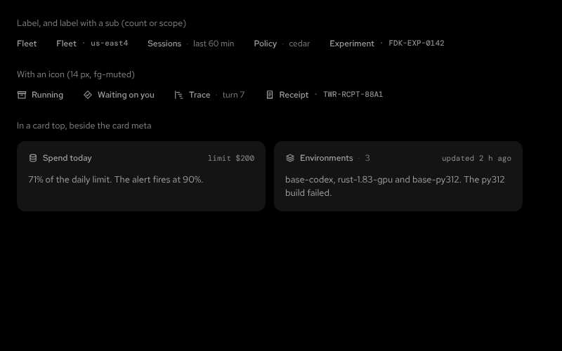 LabelFoundationsSmall sentence-case sans that names a card or section, with an optional sub and iconNightDay
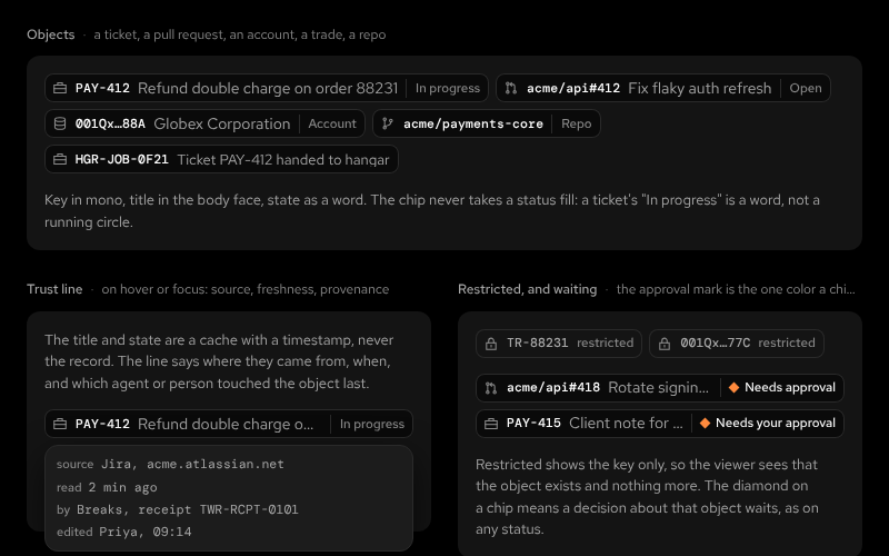 ObjectChipFoundationsA business object by reference: glyph, key, title, state; trust on hoverNightDay
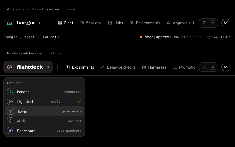
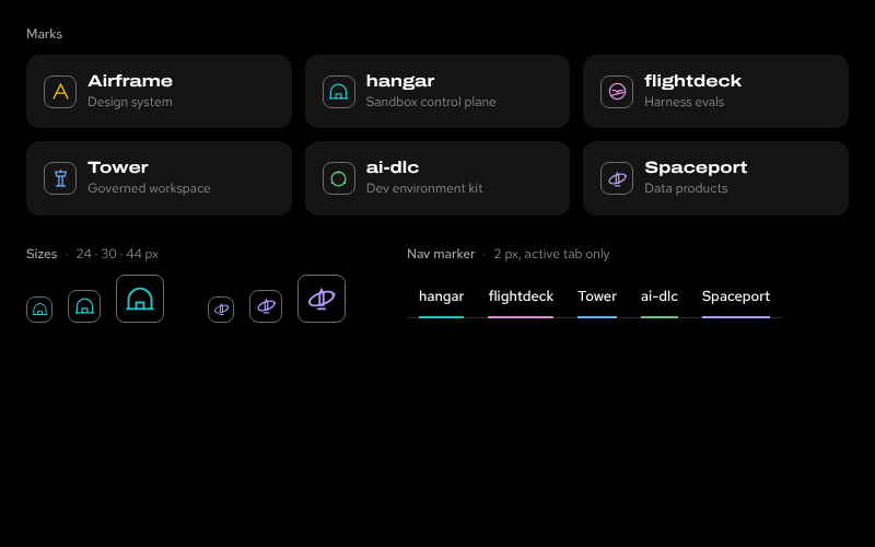 ProductMarksFoundationsOutline tiles, glyph in the product hue; the hue's only other home is a 2px nav markerNightDay
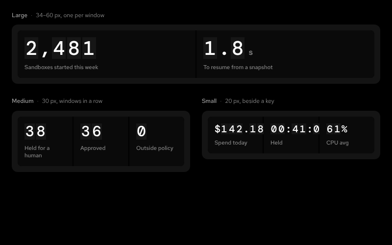 ReadoutFoundationsMono digits on unlit cells inside a recessed display windowNightDay
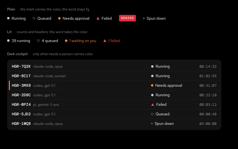 StatusFoundationsColor + shape + word; plain, lit, and the dark-cockpit ruleNightDay
Cards
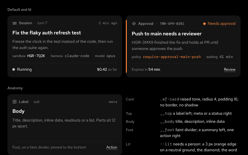 CardCardsTonal, no border: top, body, foot; default and litNightDay
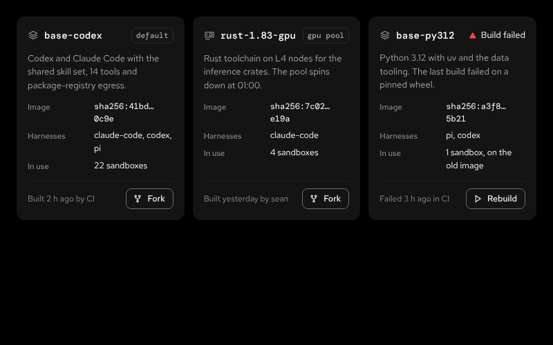 EnvironmentCardCardsAn image a sandbox boots from: name, purpose, digest, use; one failed buildNightDay
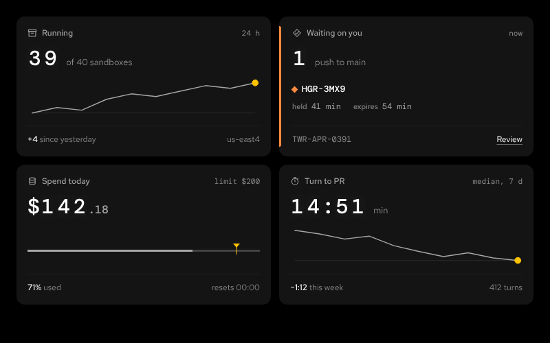 SummaryCardsCardsRunning, waiting on you, spend today, turn to PRNightDay
Controls
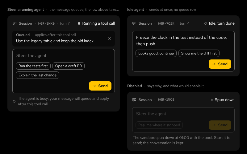 ComposerControlsAn input with suggestion chips and one send button; a queued message with a take-back; a disabled state that says whyNightDay
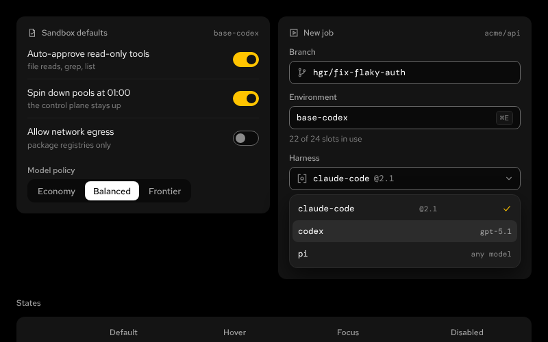 ControlsControlsSwitch, segmented control, text input with a key hint, select field; hover, focus, disabledNightDay
Navigation
Patterns
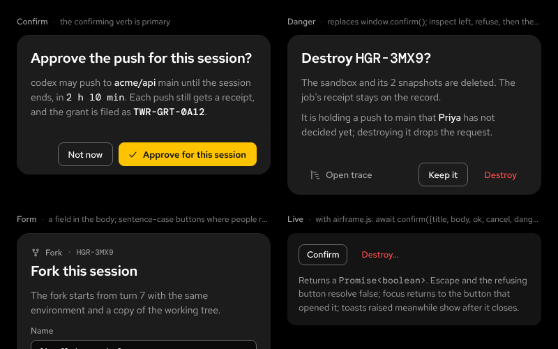 DialogPatternsA <dialog>: title, body, footer in inspect / refuse / accept order; the confirm and danger variants replace window.confirm()NightDay
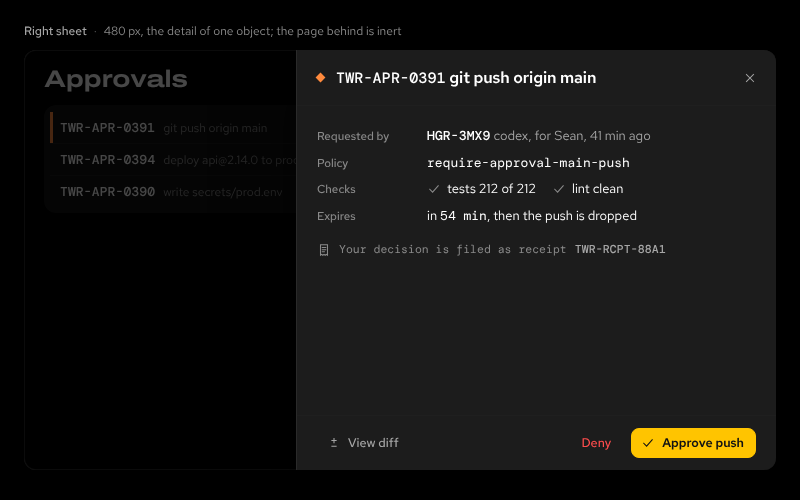 DrawerPatternsA right sheet and a bottom drawer over a scrim, with airframe.jsNightDay
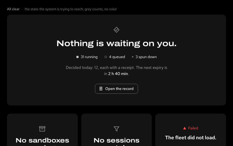 EmptyStatePatternsClear, no data, after an action, error; a compact variant for panelsNightDay
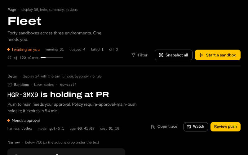 PageHeaderPatternsTitle in two sizes, a lede, a summary line (status mark, keyed counts, capacity), an actions slot; stacks when narrowNightDay
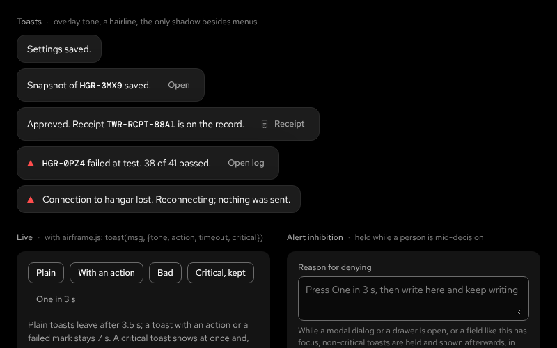 ToastPatternsBottom centre, overlay tone, one optional action; the bad variant carries the failed mark; role=status; held while a person is mid-decisionNightDay
Alerts
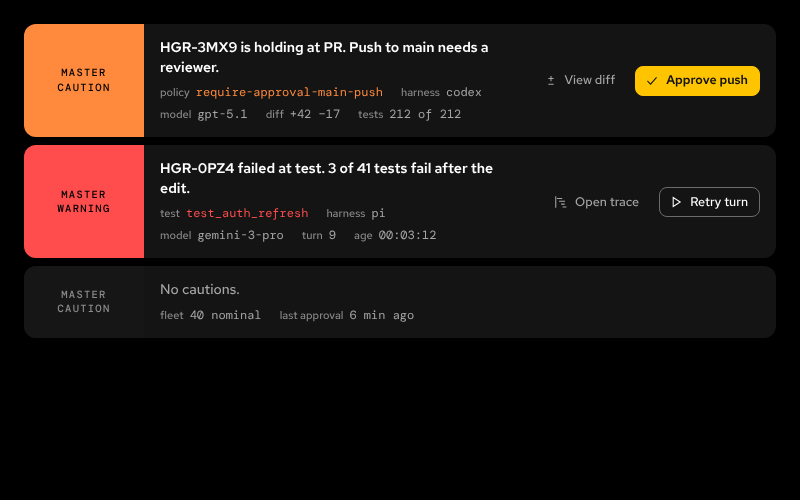
Governance
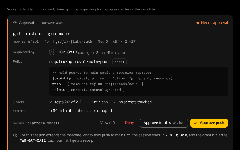 ApprovalCardGovernanceA held action: inspect, deny with a reason, approve, quorum; verdict rowsNightDay
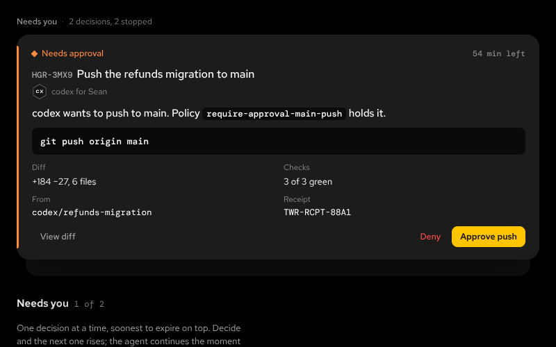 DecisionDeckGovernanceOne decision at a time: the soonest to expire on top, the next two peeking, n of N, previous and next, an up-next list; approve, deny with a reason, answer, retry, acknowledge, inlineNightDay
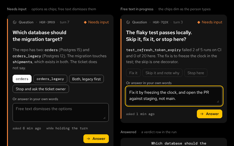 QuestionGovernanceAn agent asks a person: the question, its context, option chips or free text, one primary action; the same diamond, the word Needs inputNightDay
Data
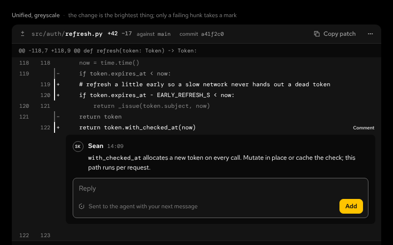 DiffDataA unified greyscale diff: stat, hunks, line comments, the one failing hunkNightDay
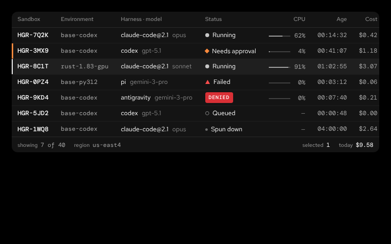 FleetTableDataDense 32px rows: tail number, environment, harness and model, status, CPU, age, costNightDay
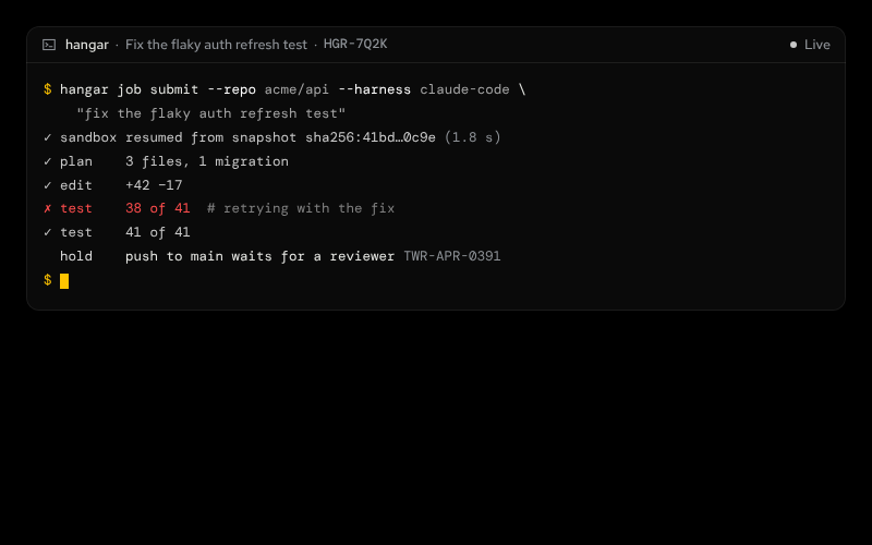 TerminalDataAlways dark, mono output under a sentence-case bar; quiet ✓ lines, red ✗ lines, prompt and cursor in brandNightDay
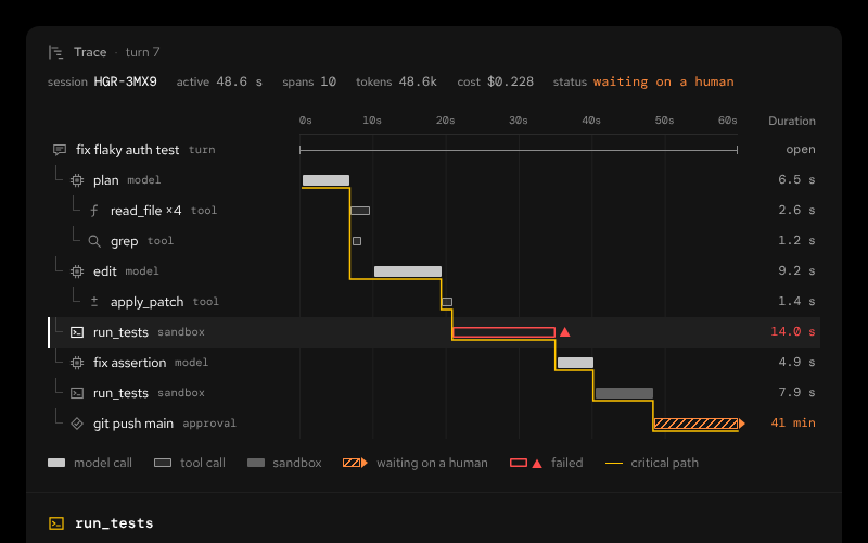 TraceSpansDataSpan tree, timeline, critical path, detail panelNightDay
Fleet
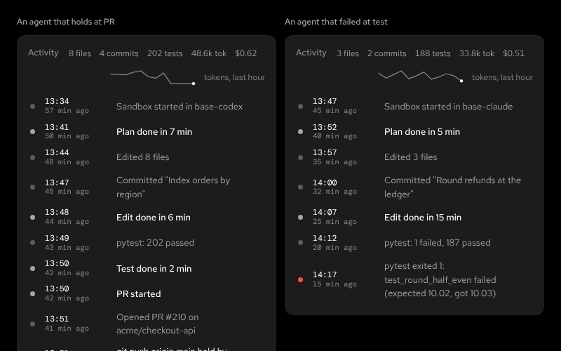 ActivityTimelineFleetWhat an agent has done, in order: wall-clock time, how long ago, the event; stage boundaries in fg, the latest dot litNightDay
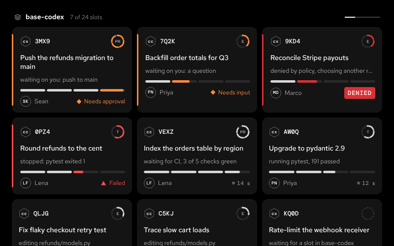 AgentCardFleetThe board card: hex avatar, tail, stage ring, work, now-line, capsule, owner, and the status word or the heartbeatNightDay
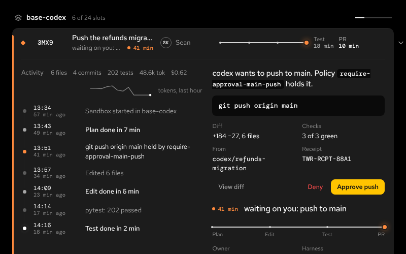 AgentRowFleetThe Runway row: mark, tail, work and the live now-line, owner, harness, rail, stage times, tokens, cost; it opens in place into a consoleNightDay
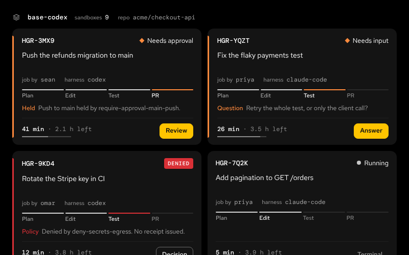 FleetBaysFleetA box per sandbox: task, owner, stage track, time left, one actionNightDay
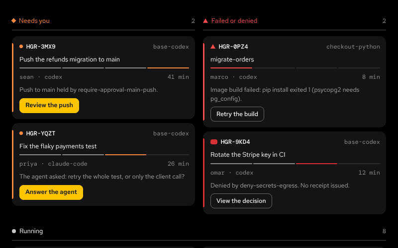 FleetColumnsFleetOne column per state, attention first; Running spans twoNightDay
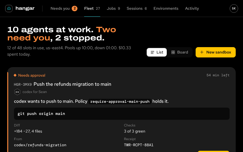 FleetConsoleFleetThe composed Fleet: decision deck on top, the runway (rows) or the board (cards) below, an agent open in placeNightDay
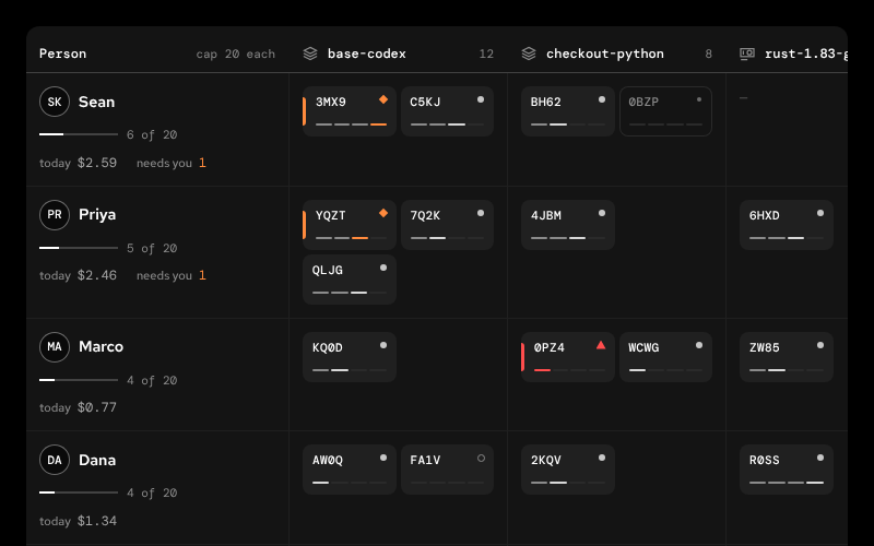 FleetOwnersFleetPeople down, environments across: who uses the capacity, and whereNightDay
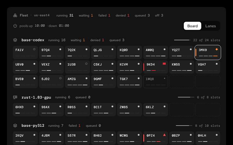 FleetViewFleetPools of stand tiles; switch to session lanesNightDay
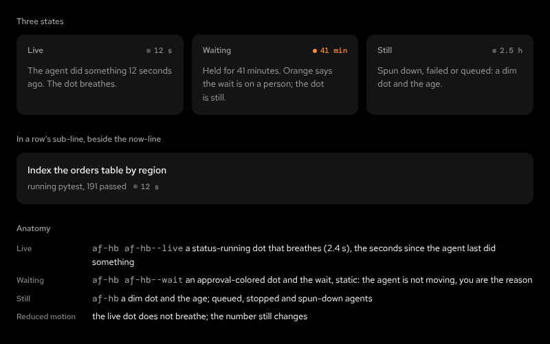 HeartbeatFleetA recency dot and the time since the last activity; it breathes only for a live agentNightDay
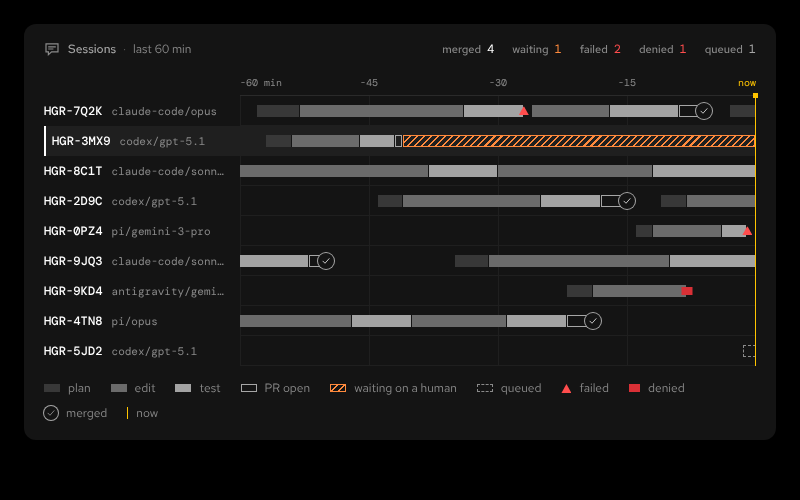 SessionLanesFleetLast 60 min of sessions: stages, waits, outcomesNightDay
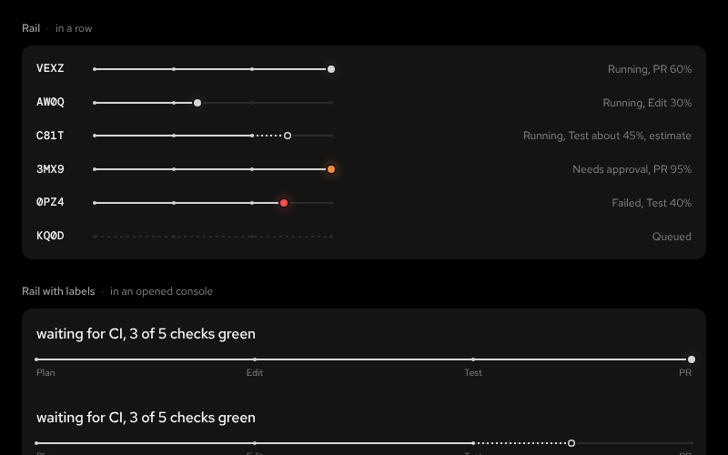 StageRailFleetPlan, edit, test, PR as a rail, a ring or a capsule; solid only for a reported pct, dotted for an estimate; the head takes the status color when a person is neededNightDay
Marketing
Conventions
- Names are BEM under
af-.af-card__foot,af-btn--primary,af-status--approval. State classes areis-active,is-selected,is-attention. - Markup is yours. Airframe ships CSS and one optional helper module, no framework. Render the markup the README shows from whatever your app uses, or build it with
airframe.js(status(),btn(),meta(),avatar(),obj()). The helpers return the same markup with every value escaped.toast(),confirm(),drawer,expandanddeckcarry the behaviours. - Patterns are components. The page-level recipes (page header, empty state, toast, dialog, drawer) live in
airframe/components/under thePatternsgroup with the same README and preview contract. - New parts start as tokens. If a screen needs something the components don't cover, build it from
var(--af-*)tokens in the tool's own CSS. Propose it here once a second tool needs it.